Stelya
Branding
Complete visual identity for Stelya, an engineering consulting firm. Creation of a logo, icon, and LinkedIn identity pack, with a defined color palette and typography. A positioning that is premium, serious, and tech-forward.
Project Context
Brief and Objectives
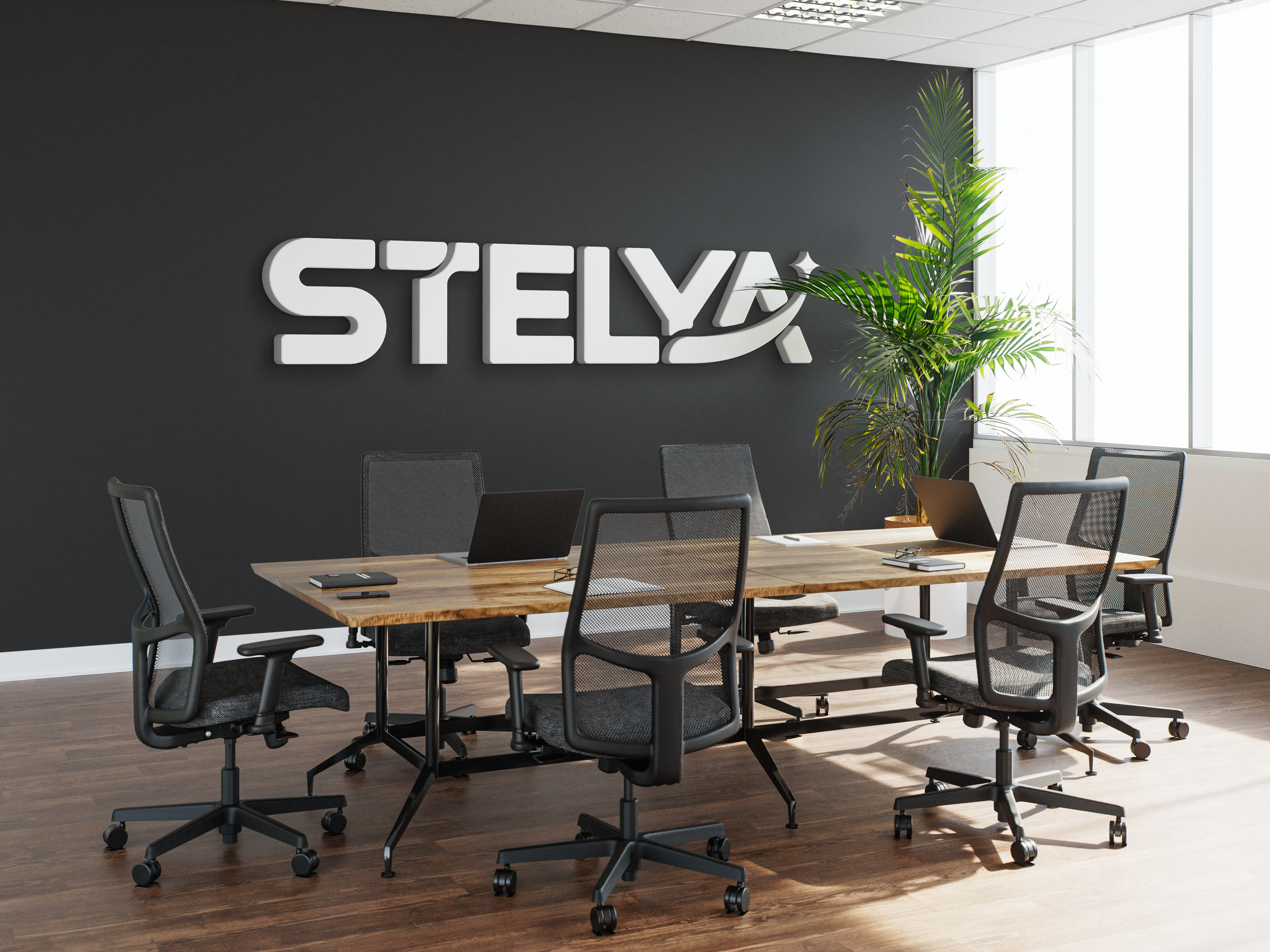
Stelya is an engineering consulting firm built around a core promise: helping clients grow through collaboration. The visual identity had to embody that ambition while reflecting the values of the industry: technical precision, stability, and strategic vision.
Concept & Logo Construction
To ground the logo in the engineering world, I built it on a strict vector grid, ensuring rigorous proportions between every element. This structured approach reinforces the brand’s credibility and professionalism.
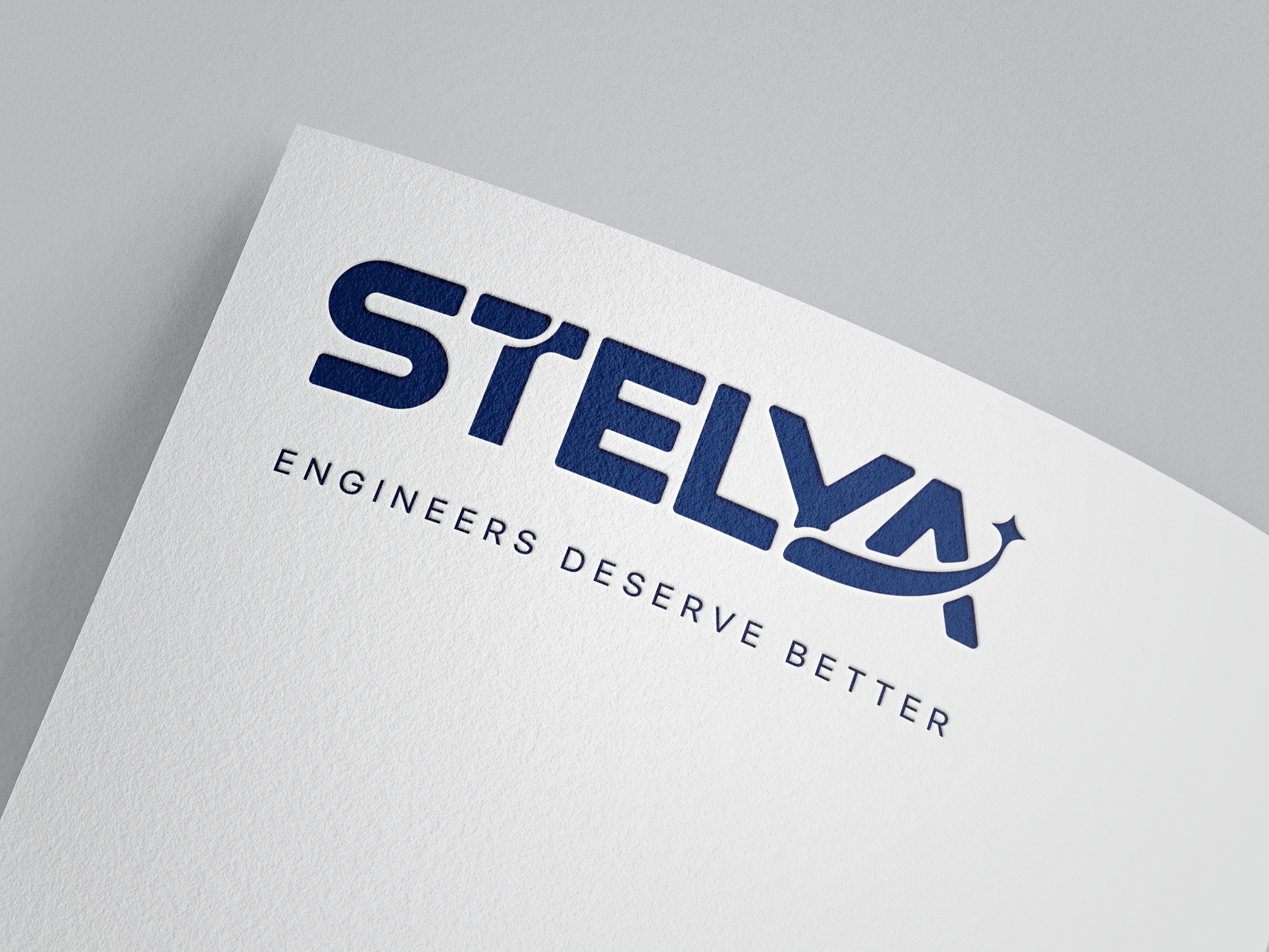
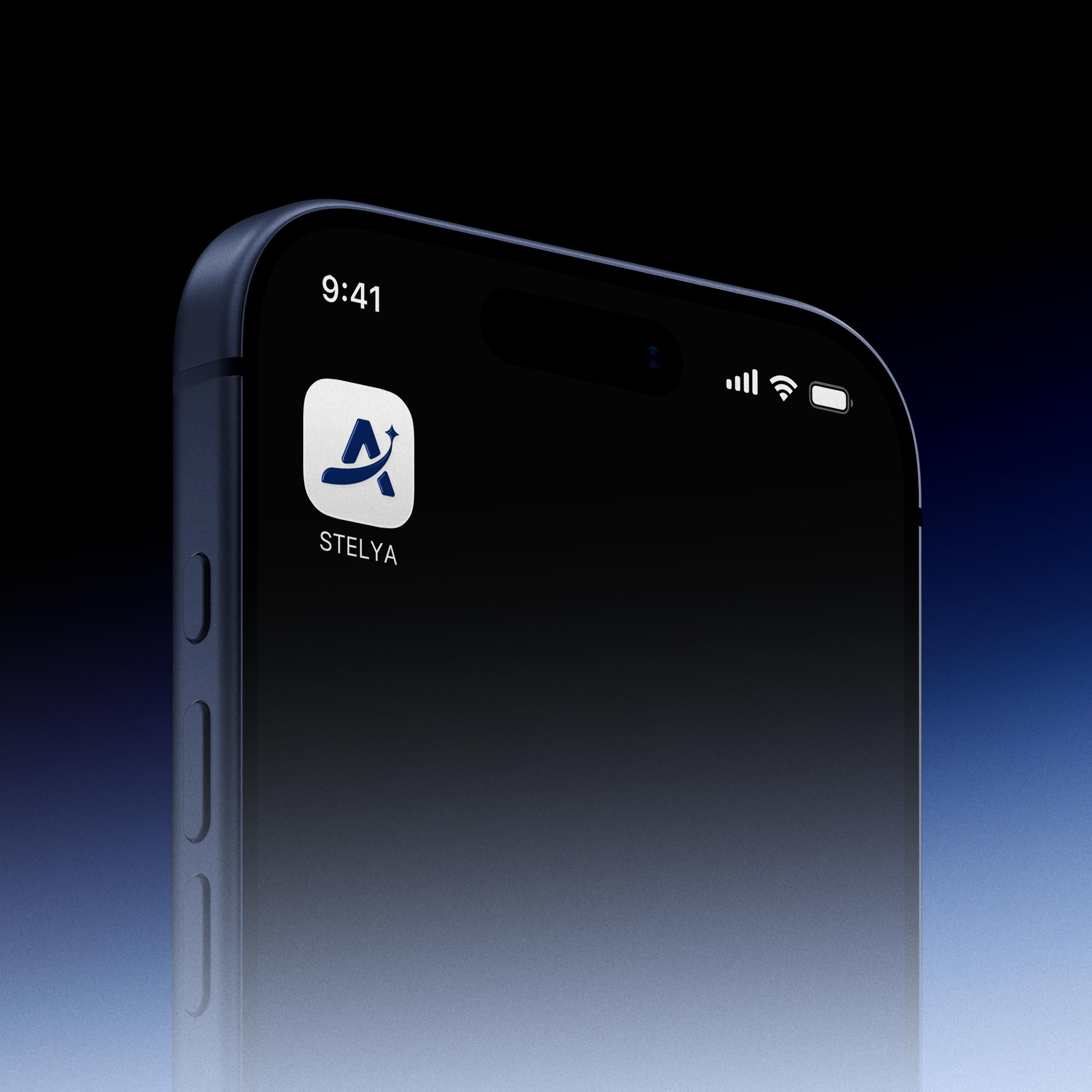
Stelya’s promise is expressed visually through a shooting star whose tail originates at the base of the letterforms and extends to the end of the logotype, a subtle yet meaningful symbol evoking momentum, trajectory, and the growth of the clients they support.
Typography
After several discussions with the client, we settled on Montserrat for its premium, timeless character, in line with Stelya’s high-end positioning. My initial proposal leaned toward Space Grotesk, whose geometric structure would have nicely echoed the engineering world, but we ultimately chose a more classic typeface that better matched the client’s expectations.

Colors
Typography
Got a similar project in mind?