PAID MEDIA & MOTION DESIGN
Discovery Set Social Ads
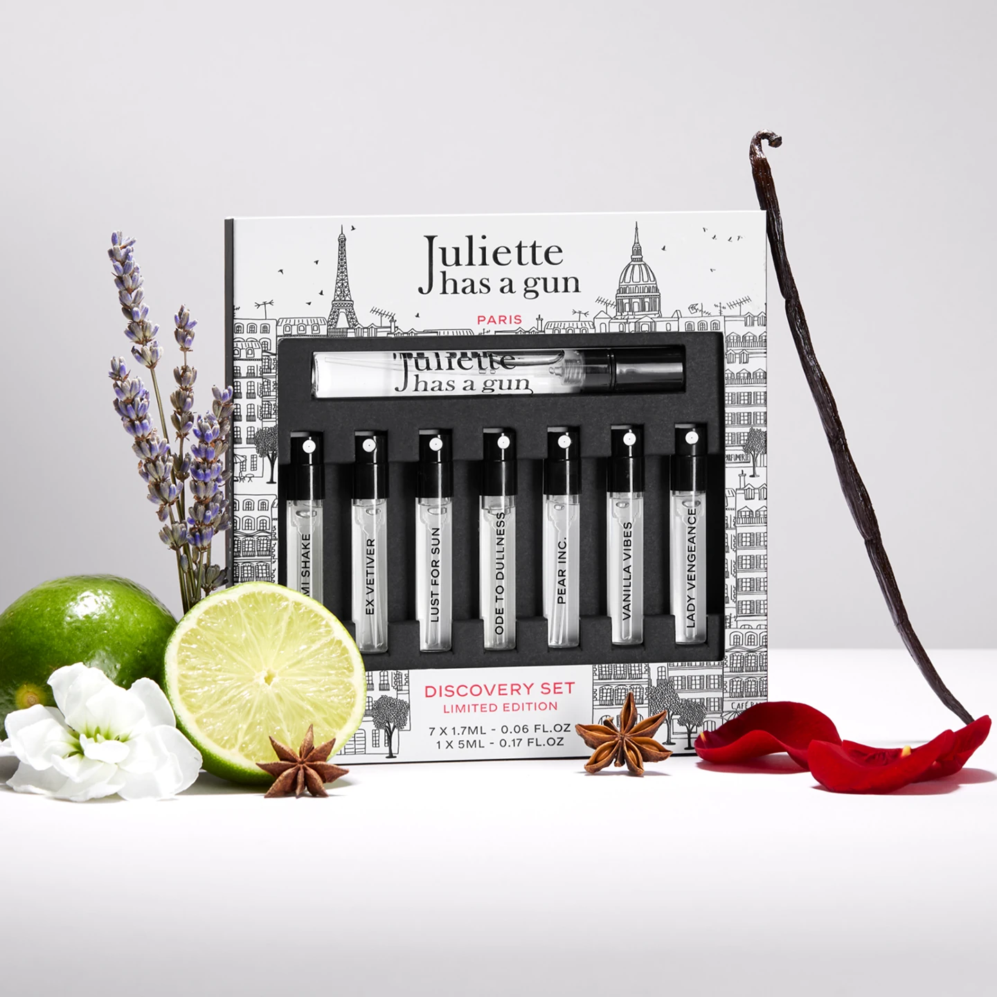
Typographic integration, ad layout styling, and multi-format adaptations (1:1, 4:5, 9:16) for 3 bilingual (FR/EN) static ad concepts promoting the Discovery Set.


Ad Mechanics & Anti-Blind Buy Strategy
Graphic curation of the “Try before you buy” conversion mechanics for the Discovery Set. The creative challenge was to overcome the friction of online fragrance shopping (blind buying) by highlighting an irresistible offer: test all the house’s bestsellers for €30, fully refundable as a voucher towards a full-size favorite bottle.
Visual Territories & Set Design
Ad layouts and copy integration across 3 distinct visual environments provided by the brand. The first, a minimalist fuchsia pink setup focusing on the raw offer; the second, a textured gray environment highlighting the natural ingredients of the fragrances (lime, vanilla, lavender); and the third, a saffron yellow setup with lifestyle-forward styling evoking a ritual of curation and writing.
Typographic Layout & Multi-format Execution
Information hierarchy and integration of the brand’s premium typographic guidelines. Each static concept was meticulously adapted to 3 key ratios (1:1 square, 4:5 portrait, and 9:16 stories) while focusing on the high-impact legibility of key conversion hooks (“risk-free”, “€30 off”) in bilingual English/French versions.
- Client
- Juliette has a Gun
- Year
- 2026
- Sector
- Perfume house
- Context
- Discovery Set conversion campaign
- Services
- Graphic Composition, Advertising Layouts, Typographic Integration, Multi-format Adaptation
- Formats
- 1:1 · 4:5 · 9:16
- Tools
- Figma
Colors
Typography
Got a similar project in mind?