EXIT
Poster
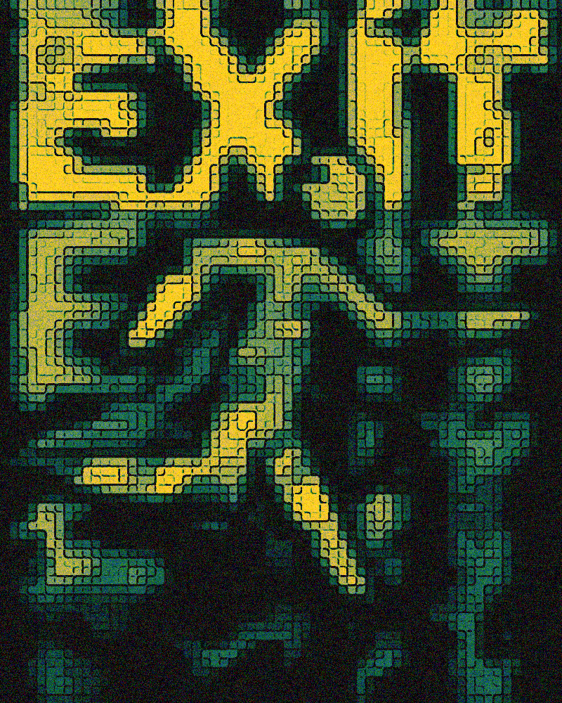
Graphic reinterpretation of emergency exit signs with an oxidized copper treatment, blending typography, geometric shapes, and contemporary textures.
About the project
Context and objective
This project is an artistic exploration of the symbolism behind emergency exit signs. The idea was to repurpose these universal signage elements into a contemporary graphic composition, playing with the contrast between their utilitarian function and a more organic, weathered aesthetic.
The starting point was an old Illustrator file from my friend @alxndr.rawz, who had explored similar concepts by redesigning the elements of the famous “exit” sign.
Research and concept
Building on this file, I wanted to push the concept further by adding my own vision. I imported the base elements into Photoshop and began experimenting with different layers, textures, and graphic elements. The goal was to create a visual tension between the geometric rigidity of signage panels and a more living, almost industrial materiality.
Design execution
The composition blends several levels of reading: recognizable exit pictograms, abstract geometric shapes, and typographic play. I worked on layering elements to create depth, playing with contrasts between opaque zones and transparencies.
Each element was reworked to integrate into a visual harmony while maintaining a certain graphic tension.
Finishing touches
For the final render, I chose an oxidized copper treatment, with its characteristic verdigris nuances and metallic reflections. This choice is deliberate: oxidized copper evokes the passage of time and the transformation of materials, creating an interesting parallel with the idea of “exit” and transition.
Textures were applied to give a tangible, almost sculptural aspect to the whole, transforming a simple poster into an object that seems to have lived.
Got a similar project in mind?