Project Context
Brief and Objectives
Aélio is a Reunion Island-based consulting firm specializing in AI and automation. The mission was to create a visual identity that could illustrate the duality of the company: cutting-edge technical expertise combined with a resolutely innovative approach rooted in its territory.
The challenge was to design a comprehensive ecosystem, from the logotype to the graphic charter, adaptable across various media (social media and print). The project was marked by a significant challenge: a high level of responsiveness was required to deliver key elements ahead of a major entrepreneurial event in the Indian Ocean region, just days after the collaboration began.
Concept & Logo Construction
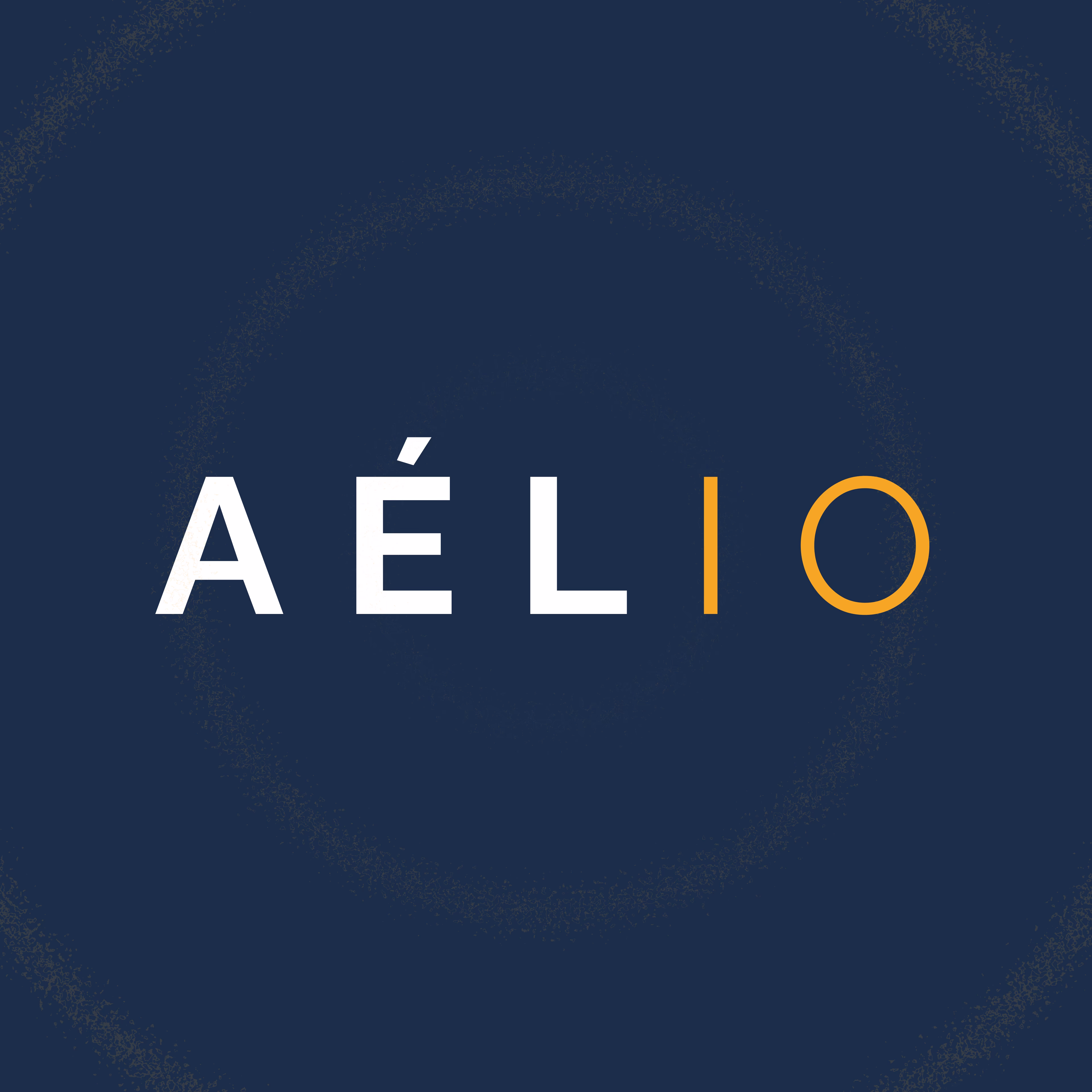
To capture the essence of artificial intelligence and automation, I designed a logotype that combines sobriety and technicality. The design is based on a modern typography with clean lines, evoking the fluidity and precision of technological processes.
The logo construction is based on a rigorous balance, ensuring optimal readability across all media. The visual identity was designed to reflect an image of constant innovation while remaining accessible and human, a key challenge for an AI consulting firm.
Visual Identity & Design System
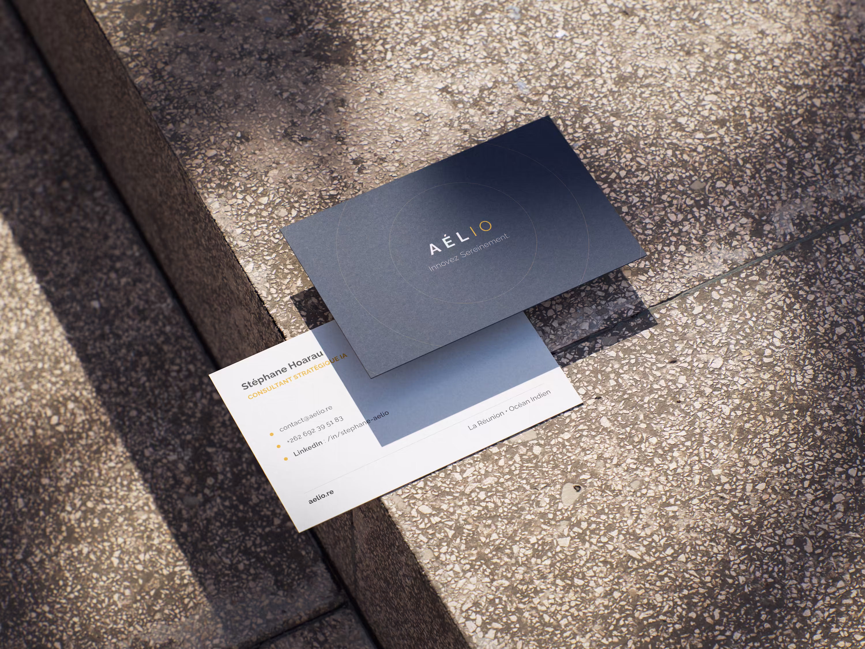
Beyond the logotype, I developed a comprehensive visual ecosystem to anchor Aélio in modernity. The color palette is dominated by a Pantone Gold, symbolizing value and excellence, complemented by a deep Navy, evoking trust and stability, as well as shades of both colors, along with white and black, to ensure great application flexibility.
The typographic choice fell on a geometric sans-serif font, Raleway, ensuring maximum clarity both on print media and on complex digital interfaces typical of AI.
Deployment & Responsiveness
The real challenge of this project lay in the timeline. To support Aélio during the major event the company was participating in, I had to demonstrate great agility.
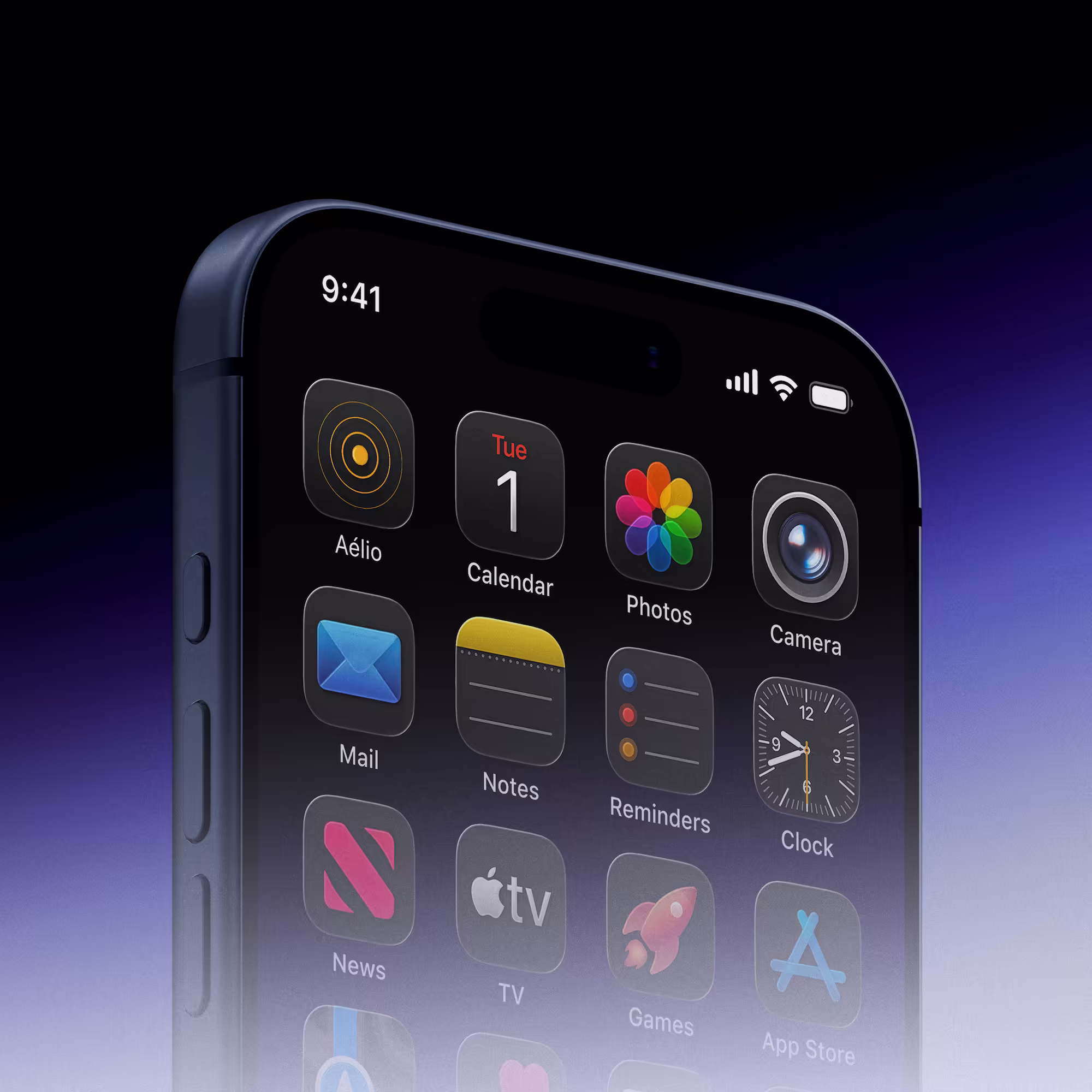
In just a few days, I delivered a complete operational pack: premium business cards, strategic LinkedIn carousel templates for their digital communication, and presentation materials. This rapid deployment allowed the company to present itself with a strong and coherent brand image from its first public appearance.
Colors
Typography
Got a similar project in mind?